The 10 Best Fonts for PowerPoint to Improve Your Presentation (2022)

Today, we’re going to show you what are
the
best fonts for PowerPoint
for your next presentation.

Best fonts for PowerPoint

As a designer in LGR Presentation, I have to work every day in PowerPoint presentation projects from different brands.
So I know what types of questions are you dealing with.

“What color palette will I use?” 

“What kind of style of typography?”

“Which fonts? What size?”

So many things to think about!

Let me show you how to choose the best fonts for PowerPoint and, also, give you some extra tips! 

Let’s dive into it…

How to choose the best fonts for PowerPoint?

First of all, you are not going to find here the PERFECT font for you.
There is no perfect font whatsoever. It always depends on you and your situation.

For instance, Apple uses all the time the font Myriad Pro Semibold.

Toucan-5
Myriad Pro Semibold

Why?

Because it is the best font
for PowerPoint presentations?

No.

They use it everywhere. It has become their font.

Choosing the font style prescribed by your company build your brand. 
If you use the font style for everything, people will identify this font style with your brand.

Like Apple!


Let me show you now the 10 best fonts for PowerPoint.

#1 ROBOTO

Roboto is an effective font, without personality.
Use it if you want to create a simple presentation.

Roboto

#2 Avenir

For an elegant and minimalist style, opt for the Avenir font,
especially if you have an innovative project.

Avenir

#3 LATO

Use it on larger font sizes and you will see the difference.
Lato is a modern, elegant font that stands out from
the crowd and shows off your style.

Lato

#4 CENTURY GOTHIC

Century Gothic specially designed for modern digital presentations.
This font maintains a design from the 20th Century
but with a x-height enlarged.

Centrury-gothic

#5 GARAMOND

Garamond is a professional font, it is ideal for
“academic” style presentations.

Garamond

#6 georgia

Georgia is a legible, modern font that
gives a welcoming look.

Georgia

#7 MONTSERRAT

A modern style, geometric simplicity in the letters, without a shadow of a doubt.
Montserrat is a font that makes an impact!

Montserrat

#8 RALEWAY

Ideal to have thick letters in your titles and elegance in your texts.
Raleway is a light and varied writing which is
very appreciated with the Powerpoint tool.

Raleway

#9 SEgoe UI

Well-known font used in Microsoft products to improve the user interface.
It is ideal for professional PowerPoint presentations.

It has spaced characters that allows for easy reading of content.
We advise to use it specially for headers.  

Segoe UI doesn’t have to be confused with Segoe Print or Segoe Script.
These two are not recommended fonts for a presentation.

Segoe-ui

#10 VERDANA

As Segoe, this is a font with spaced characters which
make it great to make clear and easy reading presentations.
This typography is neat and personalized.

Verdana

Serif or sans Serif for your PowerPoint fonts?


The font you choose can have a big impact on your Powerpoint presentation.

Serif fonts are perfect if you are going to print your presentation. They are pretty easy to read.

Sans serif fonts are better for digital presentation. They are moderns and elegants. The ones that we recommend to do a PowerPoint presentation that will appear on a screen. 


  • Serif (a foot on the bottom edge of the letters, like this one), it will direct the audience’s eyes across the bottom line of the letters. It gives the public a lot of information that they probably not need at all. This will make the slides not easy to read and follow and maybe the audience will just give up.
  • Sans serif (without foot), you will have a clean slide with it. The audience may find it hard to follow the line. This may seems to be an inconvenience, but if you manage to put just the necessary text and more visuals, the result will be great. A clean, simple slide.
Toucan-5

What about the colors of your PowerPoint fonts?

I can advise you about a specific color or palette. It always depends on you, your company and where are you doing the presentation.

However, we have some guidelines for you to help you choose the best palette for your presentation.


blog-illustration-font-1

Where your presentation will be displayed?

  • Presentation displayed in dark room: use a dark background. You can’t use a light background in a dark room because your audience will feel that they are looking into a spotlight.
  • Presentation displayed in well lit room: use a light background.  It is not recommended to use a dark background in a lit room, because the ambient room light will be reflected on the screen and then black will become grey.

Control where the audience focuses their eyes

How can you do this? It is easy.

Avoid putting a warm color next to a cold point.

The area where you want the audience to focus needs to be darker and warmer than the areas that surrounds it.

blog-illustration-font-2
Use your brand color for your presentation fonts

It is always a good a idea to use the colors of your brand in your presentations.

To get the exact colors from your company’s logo, you can use this tool from Adobe.

At that site you need to upload your logo and the website will indicate you the palette of color that you need to use from that image.

The best fonts for PowerPoint for everybody.

If you are doing a presentation for a big crowd, you need to do it for everybody.

Consider color-blindness!

blog-illustration-font-3

Learn about palette types and use it in your PowerPoint fonts

Use a complementary palette. 

Don’t mix colors without learning a little bit more about them.

Check our Color Wheel design to help you.

How to add new fonts for PowerPoint.

There are two types of fonts, those of Windows office (to be used in priority) and those that we download.

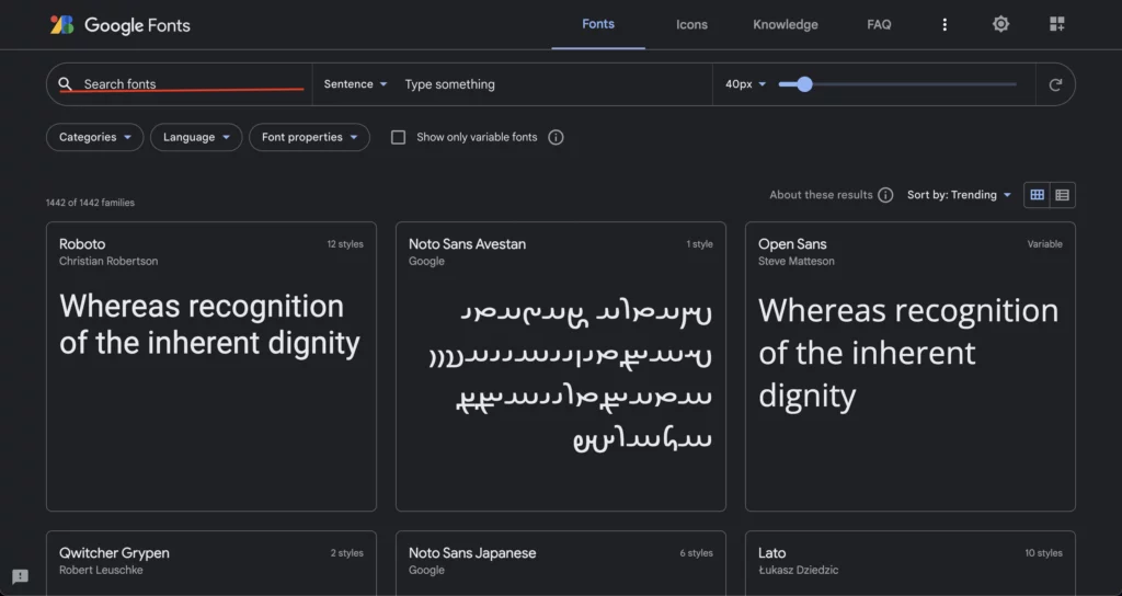
We usually download them from  Google font.

You only need to find the font you want by entering it in the search box.

Google Font

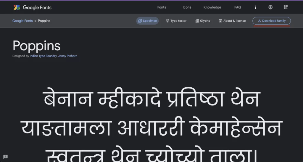
 Select the desired style.

And then, click on Download family.

Download Google Font

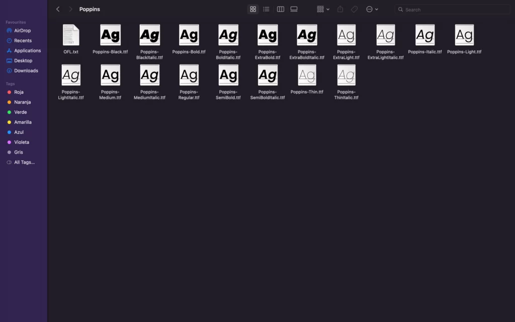
You will find the font in a ZIP file in your downloads, you just have to open and install them.

ATTENTION: You will have to close the PPT software completely and reopen it so that the new fonts appear in the drop-down list.

Font unzipped
Install-font

What fonts will you use for your PowerPoint presentation?

I’d love to hear what do you think about these fonts.

Specifically, I would like to know if…

Do you have a prefered font that you use all the time in your PowerPoint?

Let me know by leaving a quick comment below!

P.S. : If you don’t feel like choosing a font and creating a new PowertPoint, you can always use our templates. Did you know that?

Leave a Comment

Your email address will not be published. Required fields are marked *

LGR logo shape
Need a presentation?

Call, email, fill the form or book a meeting at your best convenience. We will be in touch within 24 hours.

email-contact-black

info@lgrpresentations.com

phone-contact-black

+44-20-8133-3251

book-a-meeting

Book a meeting

LGR logo shape

Need a presentation?

Call, email, fill the form or book a meeting at your best convenience. We will be in touch within 24 hours.

book-a-meeting

Book a meeting

phone-contact-black

+44-20-8133-3251

email-contact-black

info@lgrpresentations.com

LGR logo shape
Need a presentation?

Call, email, fill the form or book a meeting at your best convenience. We will be in touch within 24 hours.

phone-contact-black

Call us

book-a-meeting

Book a meeting

email-contact-black

Send an email

Thank you for filling the form!

We’ll get back to you within 1 hour.

Pop-up contact us design

Nice one!

You are now signed up for our newsletter.

Pop-up Newsletter design

Thank you for filling the form!

We’ll get back to you within 24 hours.

Pop-up contact us design